This week at Goodsmiths we launched our redesigned checkout process.
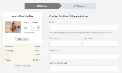
First step in the checkout process.
Because the progress bar (across the top) was one of the more interesting pieces to create, I thought I’d walk through the CSS used to construct it.
Design
First, here’s a look at the design mockups for the intended appearance:
Mockup of step 1.

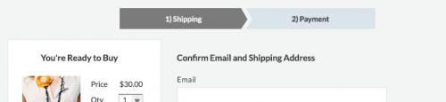
Mockup of step 2.
Hopefully, the final result looks similar. :)
Initial HTML
As always, the goal is to have semantic HTML without too much extra markup. A progress bar is an ordered sequence, so let’s start with HTML’s ordered list element:
Note that I did not include the step number in the LI contents — it is expressed semantically through the list structure.
I’ve also added some CSS classes for future styling. Of course, you could use different CSS selectors instead of classes, but I think they are useful here.
Horizontality & Basic Formatting
First, let’s turn this into a horizontal list using the standard CSS declarations. I will be writing the code in SCSS, because it is so much better than vanilla CSS.
(We’ll be needing the $padding value for other calculations soon.)
Let’s also add some basic formatting of the text and colors:
Again, we’ll need the $line_height for future calculations.
Finally, let’s include the numbering on the items using the :before pseudo-element and CSS counters. I’m going to add a <span> tag around the list contents and apply the number to that. (I’ll explain why in a moment.)
Okay, that was the easy part. There shouldn’t be any surprises here if you work with CSS regularly.
CSS Arrows
Now let’s add the chevrons (arrows) to the list items. There’s a well-known trick for creating triangles in CSS. For those who don’t know, CSS allows you to set a different color for the border on each side of a box element. Here’s a square element with wide borders:
Notice the diagonal lines at the corners? Here’s what happens when you make the box zero pixels in size and increase the border width:
Now, let’s make all but one side transparent:
Neat, huh? Because the effect requires the element to be zero width/height, it has to be used on a throwaway element, or more commonly, a pseudo-element like :after. You can use a generator like cssarrowplease.com to do this for you.
Appending the Arrows
Okay, now let’s append some arrows to our list items.
Some notes:
- I’m calculating
$arrow_sizefrom the height of list item, because the arrow should extend the full height. Unfortunately, the downside of using the CSS Arrow method is that the width of the arrow can’t be adjusted… it will always be half of its height. - For best rendering results, the height of the list items (and thus the arrow) should be an even number. Some browsers (like Chrome) have weird ideas of rounding.
- Unfortunately, elements that come later in the HTML are rendered later, so they will overlap preceding elements. This is undesirable in our case, because the arrows need to overlap the items that follow. To get around this, we give earlier items a higher
z-index.
Prepending the Cutouts
If the arrows just needed to overlay the following item, we could just add some padding to the front of each item and call it a day. But we want a bit of gap between the items. For this, we need to add a cutout to the front of each item and shift it right.
Creating a cutout is the same as creating a triangle — just invert the transparency:
Now if we prepend a triangle cutout to the front of each item:
Notes:
- This is where the semantically-empty
spanelement comes into play. Because each item has an arrow and cutout, an extra (pseudo-)element is needed. You may be able to place it on:beforeinstead of another:after, but an extra element is needed anyway for the list numbering. - If you wanted to save space, you could overlay the cutout on its list item and use the page background color instead of
transparent. Prepending it is a bit cleaner, and works with background images or gradients as well, at the cost of wider list items. - I added 5px to the left margins for the gap. You can tweak this to whatever value you want.
- I added extra right padding to the
spanelements to keep the text centered.
Cleanup
Finally, we don’t want arrows at the beginning or end of our list, so let’s remove those:
Voilà! Note that IE8 doesn’t support :last-child, so you’ll need a polyfill or different selector to support that version.
From here you can give the list items equal widths, and center the whole thing on the page.
Comments? Do you know a better way or have improvements?


